How To Match A Glass Splashback To Your Cabinets And Benchtops (Newcastle Kitchen Guide)
Quick answer: match your splashback to your benchtop's undertone, and let it sit in contrast (not competition) with your cabinets. How to match a splashback with cabinets and benchtops comes down to sequencing as much as colour: because our glass splashbacks in Newcastle are made to measure and painted to your chosen glass splashback colours, you can match almost any cabinetry finish rather than settling for a stock tile range – which is exactly why splashback colour should be the last decision you make, not the first.
If you've already picked your cabinetry or had a benchtop installed, you're in the right spot at the right time. Most colour-matching regret happens when the splashback is chosen first, off a screen, before anyone's seen how the light actually hits the kitchen.
Should Your Splashback Match The Benchtop Or The Cabinets?
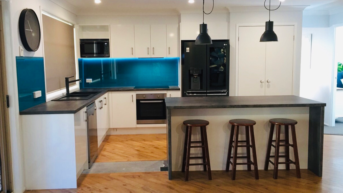
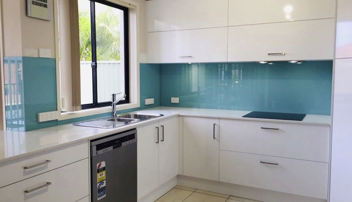
Match the benchtop, contrast the cabinets. That's the short version, and it holds up in most Newcastle kitchens we measure. Benchtops set the undertone of a kitchen because they're the largest continuous surface at eye level. Cabinets are easier to visually separate from the splashback since there's usually a bench, a rangehood or a run of tiles between them. When matching splashback to benchtop colour, the whole space reads as planned rather than assembled from three separate decisions. That doesn't mean matching cabinets is wrong. If your cabinetry is a strong, distinctive colour (deep green, navy or terracotta, for example) and the benchtop is a plain neutral, matching the cabinet colour can work well too. The rule of thumb: match whichever surface is doing the most visual work in the room, and let the other one contrast gently.
How To Get Undertones Right (And Why 'White' Is The Hardest Colour To Match)
Splashback colour for white kitchen projects is where homeowners get it wrong most often, and it's rarely about picking the "wrong white". It's about glass itself. Standard Clear glass carries a slight green tint, most visible along the edges and over pale colours. Paint white or off-white onto Standard Clear and that tint shows through, especially in bright, direct light. It's the single most common colour-matching mistake we see, and it's completely avoidable: for a true white or any very pale tone, Starfire Ultra Clear is used instead, because it removes that green cast and lets the painted colour read as intended. Coastal Newcastle and Lake Macquarie kitchens make this worse than most. Strong, bright afternoon light moves through a kitchen over the course of the day and will expose a mismatched white far more clearly than a dim inland room would.
Beyond white, the same undertone logic applies across the board. A warm-toned timber or off-white cabinet needs a painted glass splashback with a hint of warmth to sit comfortably beside it, while a cool grey stone benchtop reads better against a cooler, slightly blue-grey painted panel than a warm beige one. If your cabinetry is already installed, the easiest way to lock in a colour is to compare samples on site – our range of splashbacks Newcastle homeowners choose from can be painted to match almost any door or benchtop tone, which takes the guesswork out of undertone matching entirely.
Gloss Or Matte: What To Do When Your Cabinets Already Have A Finish
Gloss vs matte splashback isn't really a safety or durability question, it's an aesthetic and maintenance one. If your cabinetry is already gloss, matte, or satin, the splashback doesn't need to match that finish exactly, but it shouldn't clash with it either. A gloss splashback next to gloss cabinets amplifies light and can make a small kitchen feel bigger, but it also shows fingerprints, watermarks and cooking splatter more readily than a mid-tone or matte finish. Matte and satin panels are more forgiving day to day and suit kitchens that get heavy daily use. Both are toughened safety glass, so heat behind a cooktop isn't the deciding factor here – gloss and matte are equally heat-appropriate. The choice comes down to how much daily wiping-down you're prepared to do versus how much brightness you want bouncing around the room.
Matching To Stone, Engineered Stone And Laminate Benchtops
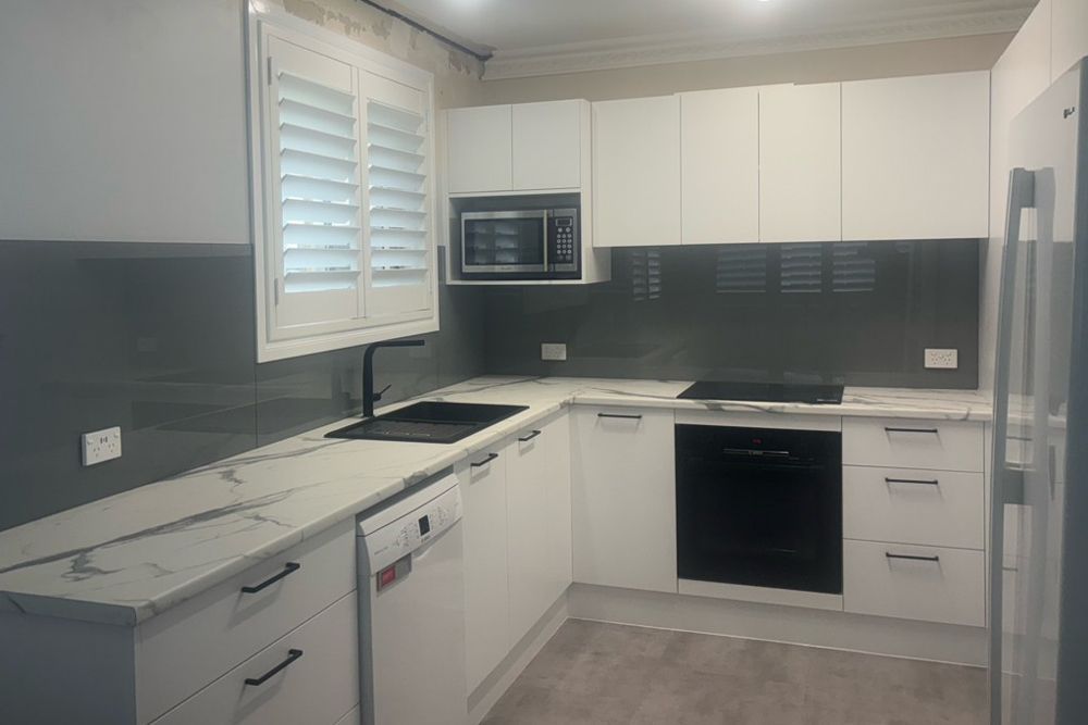
Natural and engineered stone benchtops usually carry veining or flecking that includes two or three background tones. Pick the quietest of those tones as your splashback colour reference, not the most dramatic vein colour, and the panel will sit as a calm backdrop rather than competing with the stone's pattern. Laminate benchtops tend to be flatter and more uniform in colour, which actually makes matching easier – there's less variation to reference, so a painted glass panel can be matched almost exactly. This is also where painted glass earns its keep over tiles. Tiles come from a fixed stock range, so you're choosing the closest available colour and hoping it's close enough. Painted glass is produced to your chosen colour code, so it can be matched to almost any benchtop or cabinetry colour rather than the nearest compromise. This is the practical heart of how to match a splashback with cabinets and benchtops when stone is involved: reference the background, not the feature vein.
Working With Neutral Cabinets Vs Bold Or Dark Cabinets
Neutral cabinetry (white, cream, soft grey, most timber tones) gives you the most flexibility. A mid-tone neutral splashback is genuinely the easier choice here, and for a busy family kitchen it's usually the right one: it won't show every mark, it won't date quickly, and it won't fight with whatever colours come and go on the benchtop through accessories and styling. Bold or dark cabinetry (navy, charcoal, black, deep green) needs a slightly different approach. A splashback that's too close in tone to dark cabinetry can flatten the whole wall into one block of colour with no definition between elements. A touch of contrast, even a few shades lighter or with more warmth or coolness than the cabinet colour, keeps the individual elements of the kitchen readable as separate surfaces rather than one dark mass.
When A Mirror Or Metallic Finish Works – And When It Doesn't
A mirror splashback kitchen installation and a metallic glass splashback are the two finishes homeowners are most drawn to in photos, and the least likely to be right for every kitchen.
A mirror splashback bounces light around a room, which makes it genuinely useful in small or darker kitchens that don't get much natural light. The trade-off is real: mirror shows fingerprints, watermarks and reflected clutter more than any other finish, so it needs more upkeep and works best where the wall isn't right next to the sink or a busy bench.
A metallic glass splashback can add depth beside timber-look cabinetry where a flat painted colour would fall short, giving a bit of shimmer and dimension without going as far as a full mirror finish. It suits kitchens after a bit more visual interest than a plain colour, without the maintenance load of mirror. If your kitchen is genuinely dark and light-starved, both are worth considering. If it's a busy family kitchen with plenty of natural light already, a mid-tone painted colour will usually serve you better day to day than either.
Common Matching Mistakes Homeowners Regret
A few patterns come up again and again on site:
- Choosing white or pale glass on Standard Clear instead of Starfire Ultra Clear, then noticing the green tint once it's installed
- Picking a colour from a screen or paint swatch without checking it against the actual cabinet door or benchtop offcut in the kitchen's own light
- Matching the splashback to the boldest vein in a stone benchtop rather than the quieter background tone
- Choosing mirror or high-gloss for a busy family kitchen without weighing up the extra cleaning it involves
- Locking in a splashback colour before the cabinets or benchtop are actually installed, then finding the finished tones don't sit the way the sample suggested
Every one of these is avoidable by simply sequencing the decision correctly.
Choosing Your Splashback At The Right Point In The Renovation
Cabinetry and benchtops are chosen from physical samples in a showroom. Glass is painted to a colour code after the fact. That's the whole reason to choose your splashback last: everything else is fixed and physical by the time you're matching to it, so there's nothing left to guess. The final measure and colour confirmation should always happen after the cabinets and benchtop are fitted, using the actual cabinet door and benchtop offcut in your own kitchen's light, not a screen or a sample viewed somewhere else entirely. This is also the point where glass can be installed straight over existing tiles, provided the wall underneath is clean and flat, which matters if you're doing a partial update and keeping cabinets you already like.
If you're still narrowing down a colour before you get to this stage, our guide to coloured splashback options walks through how kitchen size and lighting affect the shade you should choose. For kitchens that need more bounce, high-gloss painted glass reflects light back into the room without the busyness of a mirror.
FAQs
Should a splashback be lighter or darker than the benchtop?
Either works. What matters more is keeping the splashback within the benchtop's undertone family, whether that's warm or cool, so the two surfaces read as intentionally chosen together rather than coincidentally similar.
What splashback colour suits white cabinets?
It depends on whether your white is warm or cool-toned. Either way, avoid Standard Clear glass for pale colours – Starfire Ultra Clear or a carefully matched painted white will avoid the green tint that shows through on Standard Clear.
Can I put a glass splashback over my existing tiles?
Yes, provided the wall underneath is clean and flat. This is common for partial renovations where cabinets are being kept and only the splashback is being updated.
Is gloss or matte easier to keep clean?
Both are grout-free and wipe clean, so neither is genuinely harder to maintain. Gloss simply shows fingerprints and watermarks more readily in bright light, so it needs more frequent wiping in a busy kitchen.
When should the splashback be measured during a kitchen reno?
After the cabinets and benchtop are fitted. Measuring and confirming colour at this stage means matching against the real, finished surfaces rather than samples or screen colours that may not translate accurately.
If you're renovating in Newcastle, Lake Macquarie or the Hunter and want to lock in a colour that actually works with what's already installed, our team offers a free measure and colour consultation. Comparing samples against your own cabinet doors and benchtop, in your own kitchen's light, is still the most reliable way to get splashbacks Newcastle homeowners are genuinely happy with once it's on the wall.